How to choose a colour palette for your cottage in nine steps
Step One: Inspiration
So while out on a bike ride near my cottage, I came across this barn with the most amazing colours in its roof. Quite the random patchwork but they seem to work together so well. I love how the blues evoke the sky and water, set off by the white and augmented by neutral greys, browns and blacks. There’s even a hint of mustard yellow there.
Step two: Setting the mood
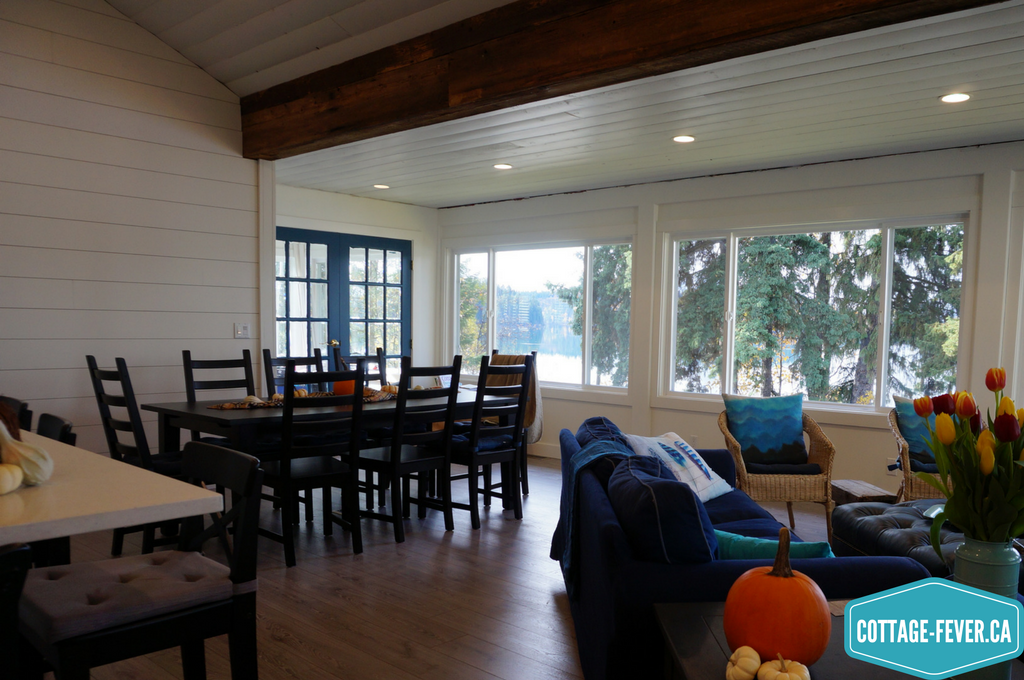
A cottage is a place to relax, put up your feet, wear a wet bathing suit indoors, and gather in large groups. I had to decide if I wanted the paint colour on the walls to be the focus or the back drop to our gorgeous setting and view. Duh, backdrop. Since we renovated with an open plan, there are views no matter where you’re standing in our main kitchen/living area. We wanted this to be the focus with your eye lead to it. We love that beachy, coastal vibe and wanted this cottage to reflect that.
Step three: When the space will be used is just as important as how
In a cottage used primarily in the summer, you can use brighter colours that reflect the season, be bold or even whimsical. However, we plan to use our cottage year round so it has to feel bright and airy in summer but warm and cosy in the short days of winter.
Step four: Consider the overall size of the cottage
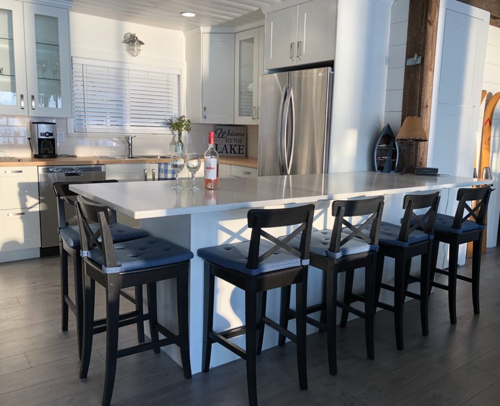
Our cottage is only 1000 square feet. We want those limited square feet to work hard which means the same colour throughout the cottage. And that colour needed to be a version of white to make the overall space feel cohesive and large. But which white? The palette has expanded way beyond “builder white”.
Step Five: Consider surroundings & which direction you face
Our cottage, like most, is surrounded by trees and grass. The light reflecting off all that green before entering needed to be considered as it could change the colour. If you face north, you might want to choose warmer colours. We face west so as the sun moves around the cottage, it starts to hit the water and we get reflected light entering the cottage. Watching the light dancing off the water and onto our walls and ceiling is one of our favourite aspects of this cottage. But we have to consider that this will be bouncing off snow come the winter. Facing west means we get fantastic sunsets but this is also a factor in choosing the wall colour. A sunset’s light is very warm with its orangey tones. This paint has to work with all these lighting considerations.

Step Six: Pick four or five colours
So white for the walls was a natural.
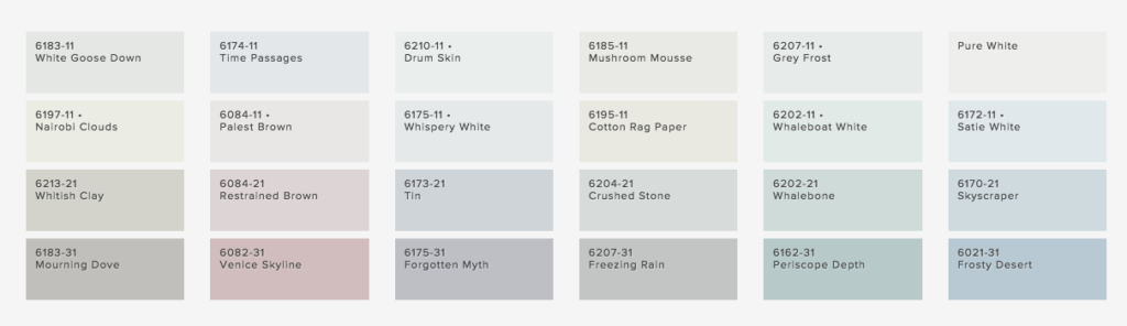
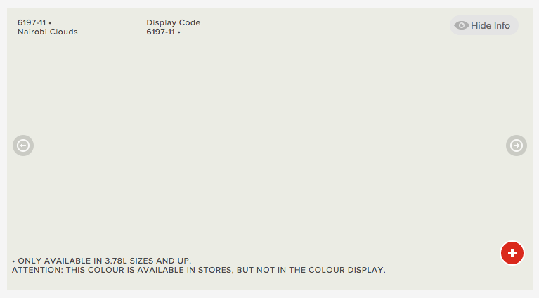
We knew we had to limit it to only colours that we could buy at Rona given that it was the only store close by to pick up more paint when we would inevitably run out. We had an advantage in picking the white. My brother and his wife who live nearby had used Nairobi Clouds by Sico for their trim paint so I could see it under similar lighting conditions. Shown below it looks a little on the green side but on our walls it becomes a very warm white but also shifts colour throughout the day adding a great deal of interest. To limit any distraction from the view, we used the same colour on our trim but in a semi-gloss finish.
Mix a warm white with a cool white
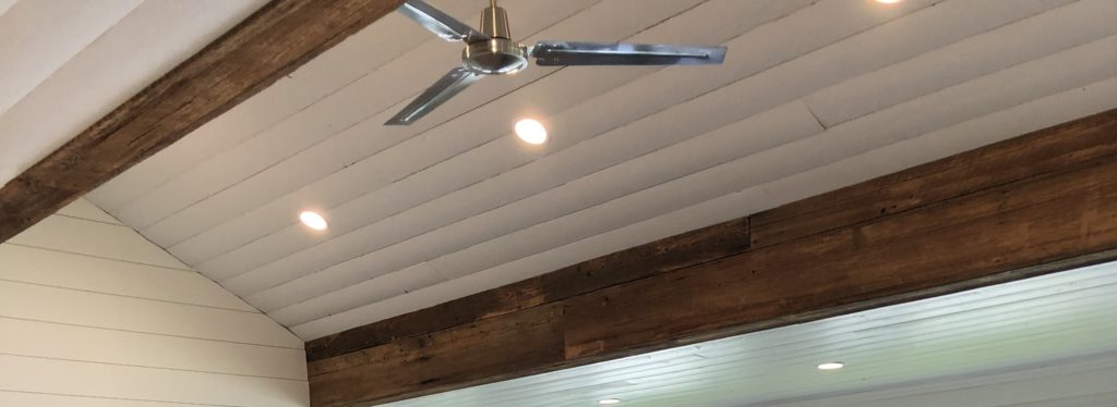
While studying interior design, one thing I learned about white is that if you are using two different whites, you should mix a warm one with a cool one. We achieved this as we used a cool white on our ceiling. Not as the result of any planning but it was left over from another painting project so it was purely because we’re cheap! White shows off architecture so was perfect to showcase the vaulted ceiling.
Another major colour element is what’s underfoot.
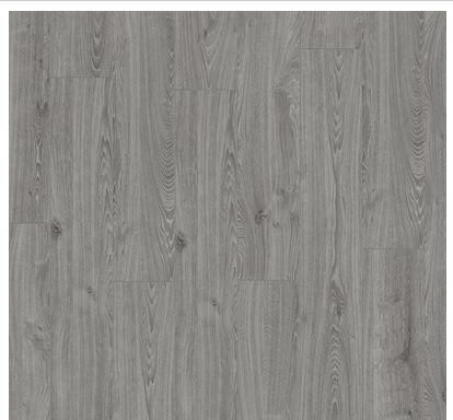
Where I live full time on the “wet” coast, we’re surrounded by beaches and I have such fond childhood memories of going to Spanish Bank Beach. The colour of the sand is so much different than what you would see in Mexico or Hawaii – much more grey. I wanted that to be the colour of our floors.

We chose a grey floor from Lowe’s in a heavy duty laminate to stand up to lots of wear and tear. And the flecks of white pick up the white colour of the walls (and hid any paint I spilled). The grey is very grounding and takes me back to my childhood summers. It’s also great at hiding dirt constantly tracked in and being a heavy duty laminate, is practically indestructible although we did manage to gouge it bringing in the washer/dryer.
The only other paint colour we used was on our interior doors. I wanted a real pop of colour to make them stand out and this blue did the trick.

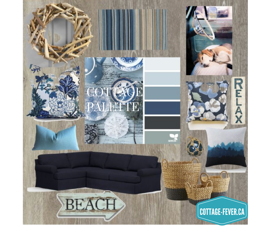
Adding a “neutral”
Our Ikea Ektorp sofas are slip-covered in navy so they combine beautifully with white, having that coastal esthetic. Some would even consider navy a “neutral” colour. Think about your blue jeans and how they seem to go with any other colour. We also equate navy with a relaxed feeling you get from wearing jeans. What I love about these slipcovers is that they’re washable. And when I want to change things up, I spend less than $300 on new covers rather than thousands on new sofas.
Step seven: Adding accent colours, texture and patterns
Now this is where you can let yourself loose with colour and pattern. Accents are not a huge financial commitment so have fun and be bold. I needed a large rug to delineate the seating area. Decorating guidelines are that the largest pattern should be on the largest item which in this case would be the rug. I went to Ikea as it’s the cheapest and has a good return policy. I can be a bit shy when it comes to pattern which means I drove rug after rug 450 km to try them out in the space. This is the one that I finally settled on:
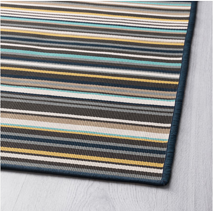
The stripe evokes the stripe of the shiplap walls. The navy picks up the sofas; the grey the floor; the white the walls; the lighter brown the wicker furniture and butcher block counter tops; and the dark brown the beams. Then I found the perfect pillows and tray to pull out the different shades of turquoise blue.
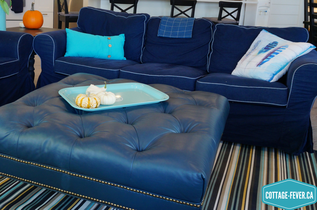
The feather pillow motif even has a subtle strip that plays off the rug and shiplap walls. Patterns and colours should be repeated within a room. And organic (feathers) patterns should be mixed with geometrics (stripes) and solids. The buttons on the smaller throw pillow echo the pattern of the studs on the ottoman. The pillows give the eye a place to linger (when not mesmerized by the view). The ottoman is navy but as it’s a completely different texture than the sofas, it reads as a different colour. Now I just need to find some small mustard accents but for now the pumpkins do the job.
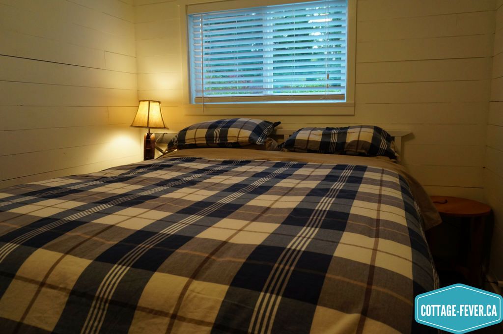
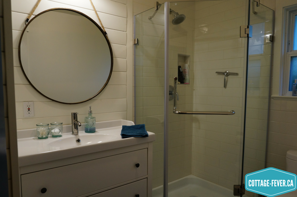
Step eight: Repeat colours throughout the space
Being such a small cottage, it was important to carry the colours throughout so it felt larger and cohesive. The laminate floors extend into the bedrooms and grey tile was used in the bathroom and mudroom. The same paint, ceiling and trim colour was used throughout. Then the blue accents were added in various ways such as bedding in the bedrooms…
And towels and accessories in the bathroom…
Step nine: Every room needs some black
Black is dramatic so you don’t need much of it. It acts as a visual anchor We went with a black dining table and chairs as well as counter stools. This black contrasts beautifully with the white Caesarstone on the peninsula in the kitchen. And the Caesarstone has veins of grey which complements the floor.
And now to recap:
- Find your inspiration
- Set the mood
- Understand when and how the space will be used
- Consider the overall size of your cottage
- Take into account surroundings and which direction the cottage faces
- Choose four or five colours
- Add accent colours, pattern and texture
- Repeat colours throughout the space
- Add in some black
What do you think of the final product? Let me know by commenting below.