Designing for short term rental
The cost of owning a vacation home, or really any home, is significant. Property taxes, utilities, insurance and maintenance all add up to a hefty price tag. I looked into renting out part of my home on Airbnb for generating some revenue for two reasons. The first was that I had just divorced and had to buy my former husband out of my home which had increased significantly in revenue, as well as sign over half my pension. At the same time, I was starting my Interior Design practice and new it would take time for the business to build. The revenue that I would gain from a short term rental was as a safeguard.
When you make the decision to rent out your property, for whatever your reasons may be, it will at first seem like a daunting task but one that comes with many upsides. The biggest one is seeing your place through the fresh eyes of your guests. I’ll share my insights on designing for short term rental, room by room.
stand out from the competition
The short term rental market, such as Airbnb or VRBO, is becoming more and more competitive with travellers expecting increasingly unique experiences. Not wanting a sterile hotel room, potential guests are looking for something very personalized, with space to spread out and enjoy. Your airbnb styling needs to be Instagram worthy! And speaking of Instagram, don’t forget to create a profile and hashtag for your vacation property!
think about your target market before you do any designing
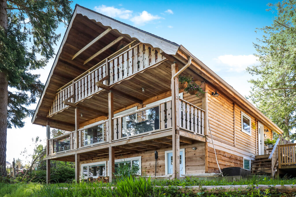
I have been very fortunate to own two vacation properties, both on a lake. My home that I currently rent out is on the ocean. Each has similar primary target markets but distinct secondary target markets.
Lake House
- Families on vacation – staying for a week
- Europeans travelling from Jasper/Banff through to Vancouver/Whistler and want a four day stop in between, wanting a truly “Canadian” experience
- Fishers – late spring/early fall and ice fishing in winter
Beach House
- Adventure traveller wanting an active stay or to see wildlife – Europeans mostly
- People travelling for personal reasons – visiting family member, attending wedding, etc…
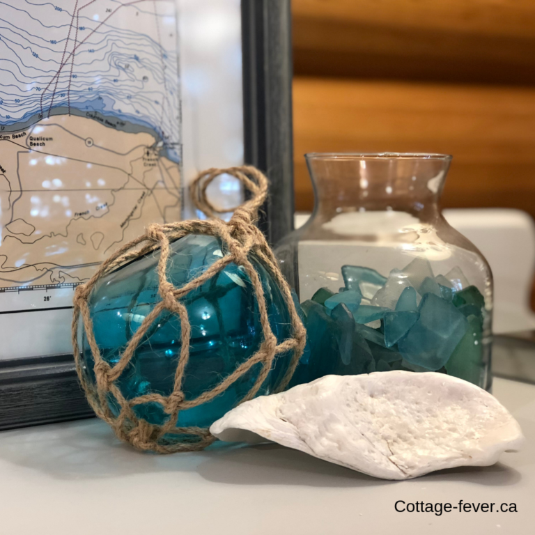
Your decor should reflect your location
If your vacation rental is on a lake, guests want to feel like they’re at the lake – not at a mid century modern in the city. Your decor should be a reflection of your surroundings. And it’s okay if it might be a little bit kitchsy like this “to the beach” sign, just be careful not to go too over the top, as it really is the little touches of personal style and whimsy that attracts people to pay more to stay in a short term rental. Guests want a memorable experience rather than just a place to sleep, otherwise they could have just booked a hotel room so your vacation rental styling has a huge impact.
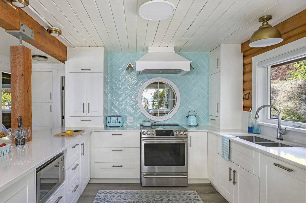
Guests really appreciate decor that reflects the owner’s personality. A round window and appliances that match the backsplash – heck yeah, that’s quirky. And memorable! And quite possibly instagram worthy, #thebeachchalet.
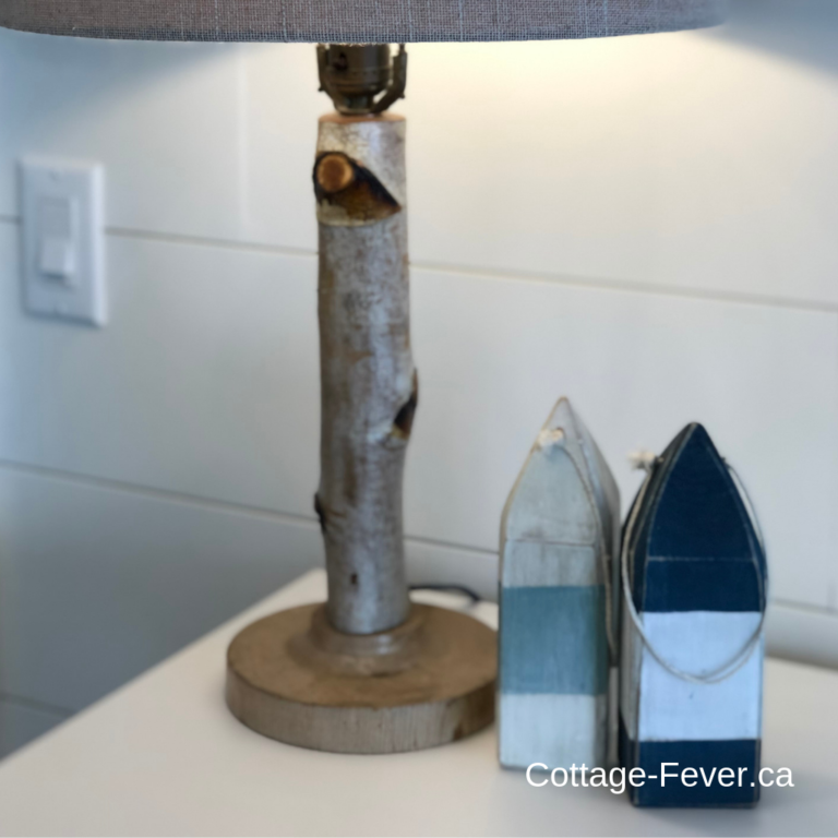
My grandfather, who passed away before I was born, created this lamp base. It fits in perfectly at a lake side cottage, in fact it looks like it was made for the space. And whether lakeside or seaside, these colourful buoys fit right in.
Tips for vacation rental decor accents
- Add personal touches that reflect your personality, travels or history
- Reflect your surroundings
- Quirky and fun is the goal!
- Accent your colour palette
determine how many people you can host
You’ve heard of “heads in beds”? At my ocean front property, I have three good sized bedrooms, one with a king and two with queen beds. So that’s six guests potentially, provided they are three couples.
At my former lake house there were two tiny bedrooms, one with a queen and one with a full sized bed so it was listed for four guests, thinking two couples.
If you’re not on-site, installing a Google Nest Doorbell allows a host to monitor how many guests actually check in. You are not insured for unregistered guests so it’s critical that no extra guests are snuck in. And you absolutely don’t want your listing to turn into a party house. It’s really critical to be a good neighbour.
Will you allow children and/or pets?
My listing is not baby-proofed, nor do I provide cots nor high chairs so my listing is set up as not appropriate for children. In my experience, the most damage is actually caused by young children. Spaghetti stains on the dining chairs, food mashed into the carpet, items knocked over and broken, finger prints everywhere – it’s way too much cleaning and damage. And I just don’t need the stress of worrying about how they might hurt themselves.
I love dogs and allow my friends and family to bring their dogs to visit anytime. However, even they inevitably cause some damage or leave some surprises behind. It’s tough enough to get all the cleaning done between guests but you add vacuuming dog hair and picking up dog poop, it’s just not worth it. Plus, I don’t want a dog left alone in my place while the owners have gone out to dinner. Who knows how separation anxiety in an unfamiliar place might manifest.
Bedrooms
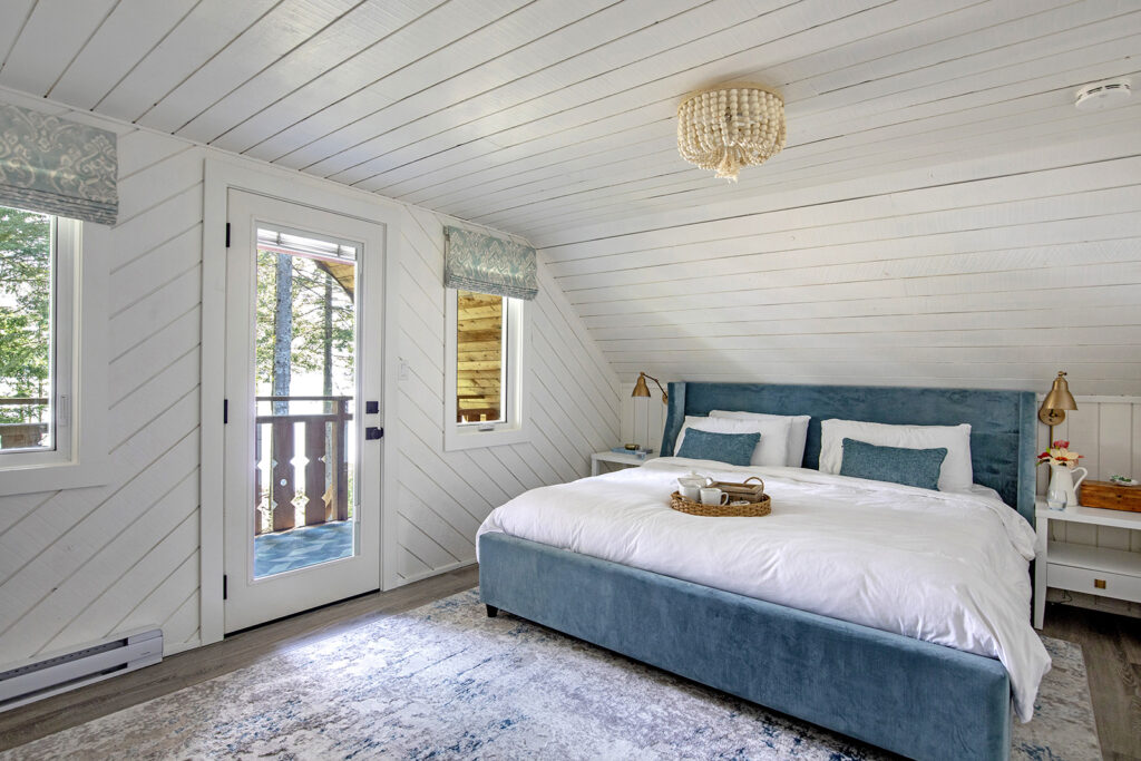
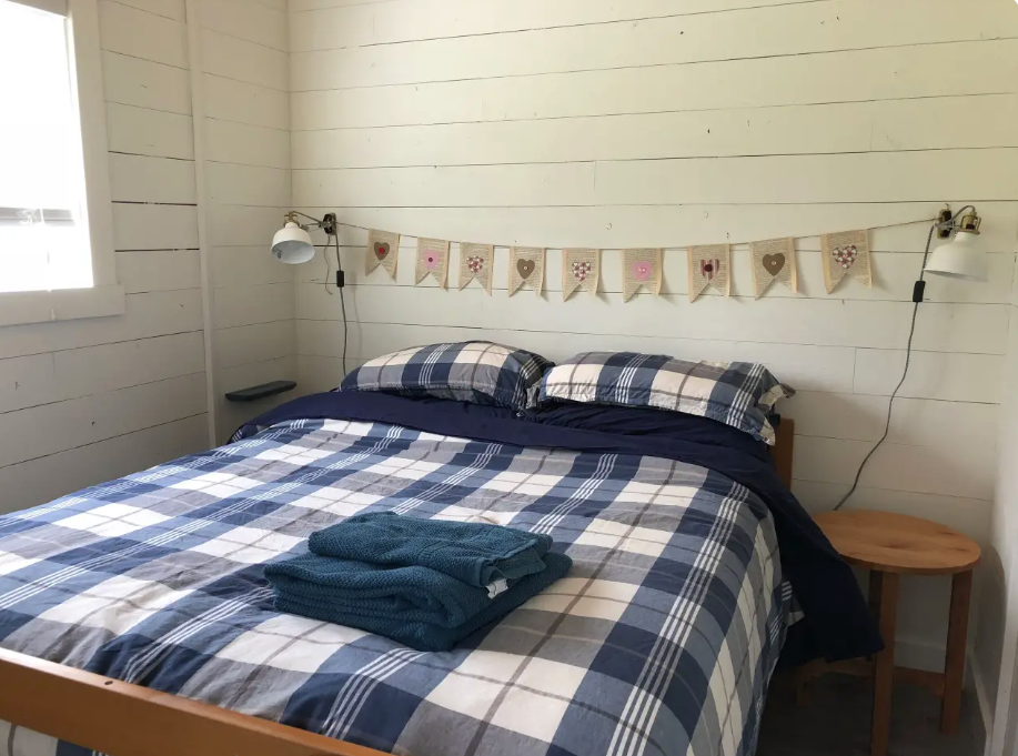
When on vacation, people just need bedrooms to sleep and drop their luggage and clothes. It doesn’t matter if the rooms are tiny as they won’t spend much time in them, but the beds and pillows absolutely must be comfortable. Endy Mattresses are great as not only do they get rave reviews, but they are much easier to transport to your vacation home than a regular mattress. I’ve used them myself as well as specified them for clients.
It’s essential that there is a light on both sides of the bed, as well as a night stand or a shelf to charge a phone, put down a book and glasses (yes, I’m at the age where I need reading glasses) and a glass of water. If there’s not room for a decent sized bedside table, opt for a shelf and plug in sconces.
With only one bathroom in the cottage, I installed mirrors in each bedroom. This way the bathroom didn’t get tied up as people put on makeup. I also installed hooks for hanging towels in the bedrooms so everyone knows which towel belongs to who. If there is space, I include a luggage rack as well.
As the two bedrooms at the lake house were close together, I used the same duvet covers for each. The blues tied together with the rest of the decor throughout the house creating a cohesiveness. In the summer time, I switch to coverlets for the warmer weather. And here’s a tip: search for kids coverlets or quilts as they are way more fun and can be less expensive.
I use white sheets. Guests immediately know that they’re clean and I can bleach them to keep them fresh. At the lake house, as the beds were different sizes, I found it saved me time to have different coloured sheets for the two beds. The queen bed had the coordinating beige colour and the full bed had sheets in navy. By using the speed setting on my washer and dryer, I find the sheets are less wrinkled and I can turn over between guests much faster. Don’t worry about wrinkled bedding. Just spritz with a lavender spray and smooth out with your hands.
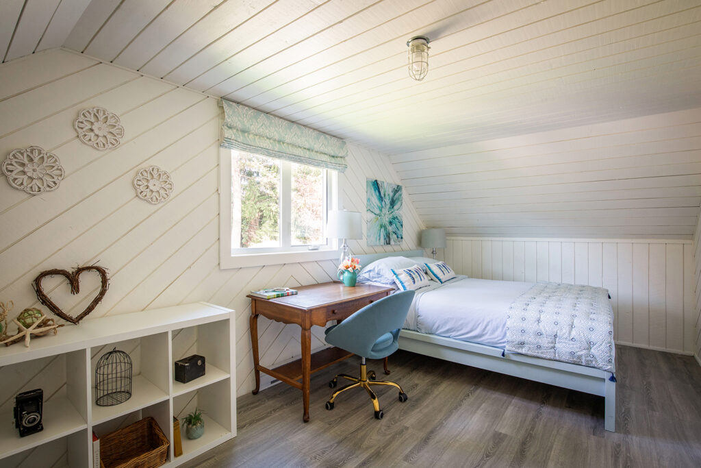
If there is space, providing a desk and comfortable desk chair means that you can attract guests who have to get some work done. High speed WIFI is also critical. Great art work over the bed creates a focal point. And roman shades takes this bedroom to a new level.
Tips for Designing for short term rental bedrooms
Living areas
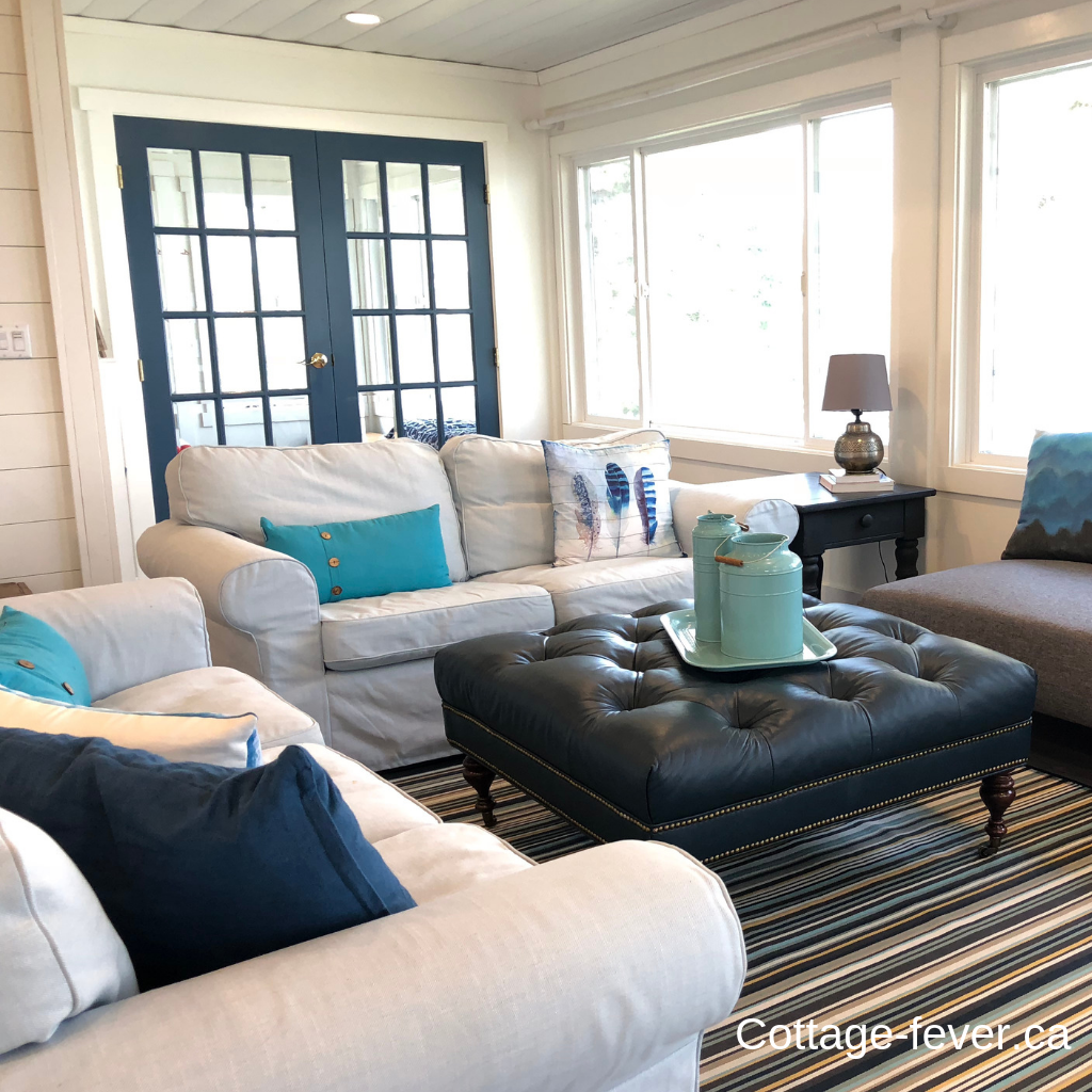
If your home sleeps six, then you need to seat six comfortably in the living area. Easy wear rugs (think indoor/outdoor) or even washable rugs in the living space pulled together all the colours throughout the lake house.
Slipcovers on your sofas means that you don’t get too concerned if something is spilled. The leather ottoman is perfect for putting up feet and relaxing which was the point of this lake side rental. Even cushion covers could be swapped out easily if one becomes stained.
If you notice the light switches in the photo above, they’re labelled. This helps guests if your switches aren’t straight forward, saving them fumbling around trying to figure it out for themselves.
Being only 1000 square feet, I needed the lake house to read large. Hence the white paint with the coastal blue accents. As the lake view was the star of the show, I didn’t want to distract from it. Shiplap walls add to the feeling of a cottage, rather than a drywalled city home.
The trick with colour is repetition. You can have up to five colours but ensure that they’re picked up throughout the space. So the turquoise on the pillows in the beach house shown below is picked up in the painting, the rug and the kitchen backsplash on the other side of the room. Repeat the colour at least three times for continuity. If you want to learn more about choosing a colour palette, click here.
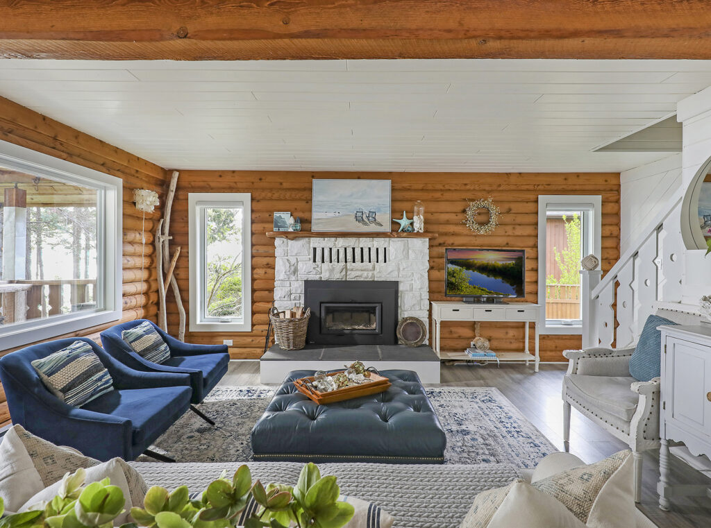
With a full sized sofa, two swivel chairs that can turn to face the ocean and an accent chair, everyone can put their feet up at the Beach Chalet, enjoying both the fire and the view at the same time. An area rug anchors the space in the open plan. Note how the white sofa is protected with an easy to wash throw. I also invested in an upholstery cleaner – money well spent.
Many people will place their television over the fireplace where it is too high for optimal viewing. Mind is at the correct height on a media console table beside the fireplace.
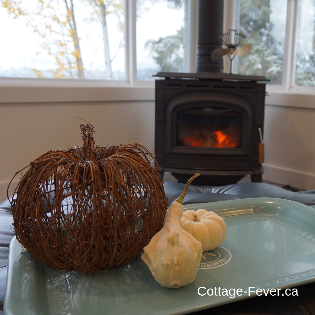
At first, I did allow guests to use my fireplace but don’t anymore as they weren’t following the necessary steps and would void the warranty. And there is a safety issue. So now I remove all firewood before guests check in.
Tips for designing vacation rental living areas
- Indoor/outdoor rug to anchor area and pull together all the colours
- Slipcovers or throws on sofas
- Replaceable cushion covers
- Enough seating for all guests
- Coffee table that withstands feet resting on it
- Label light switches
- Invest in an upholstery cleaner
Dining
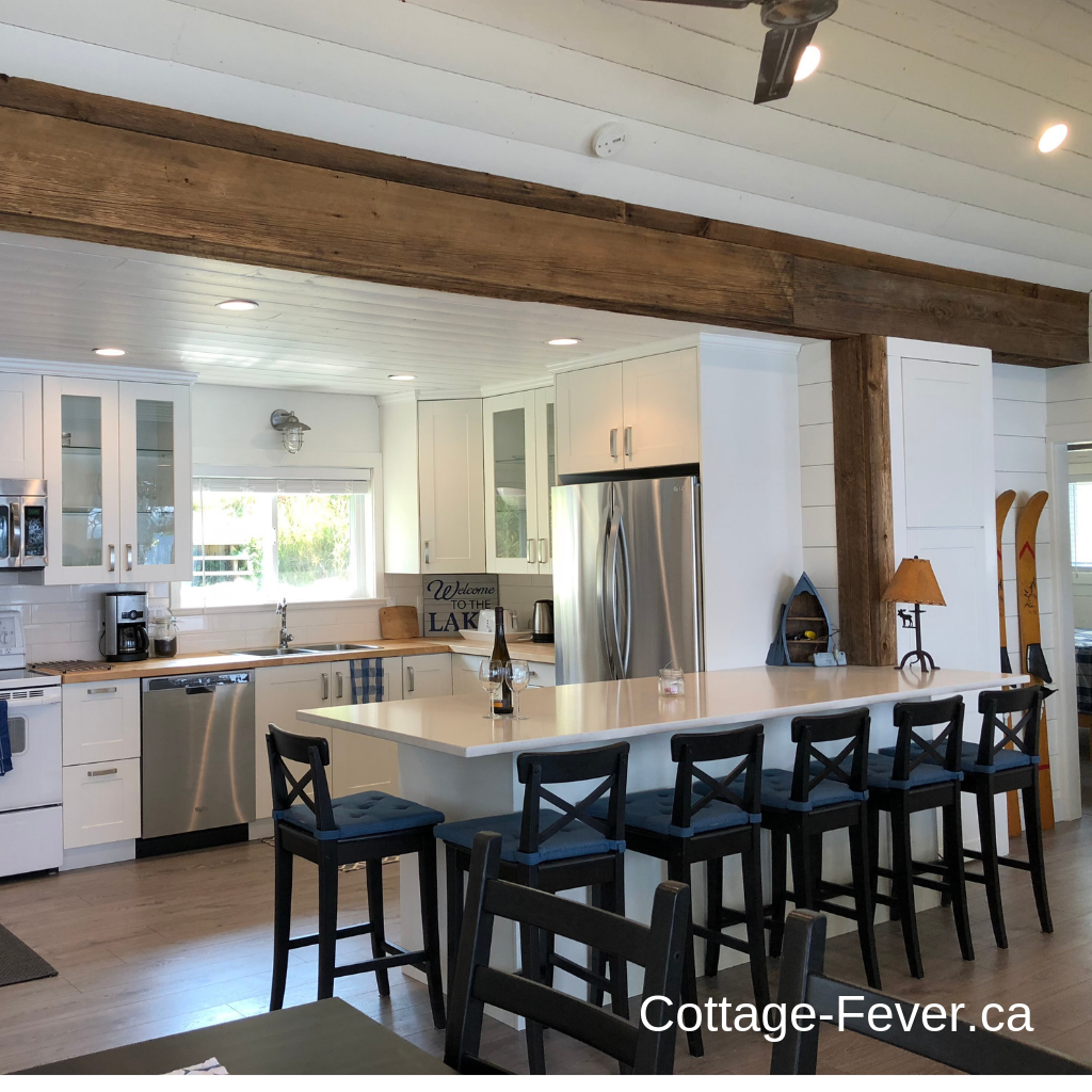
At the Lake House, I could seat six at the peninsula, six at the dining table and six at the outdoor table on the deck. Even though the rental is only for a maximum of four people, when family came everyone could be accommodated.
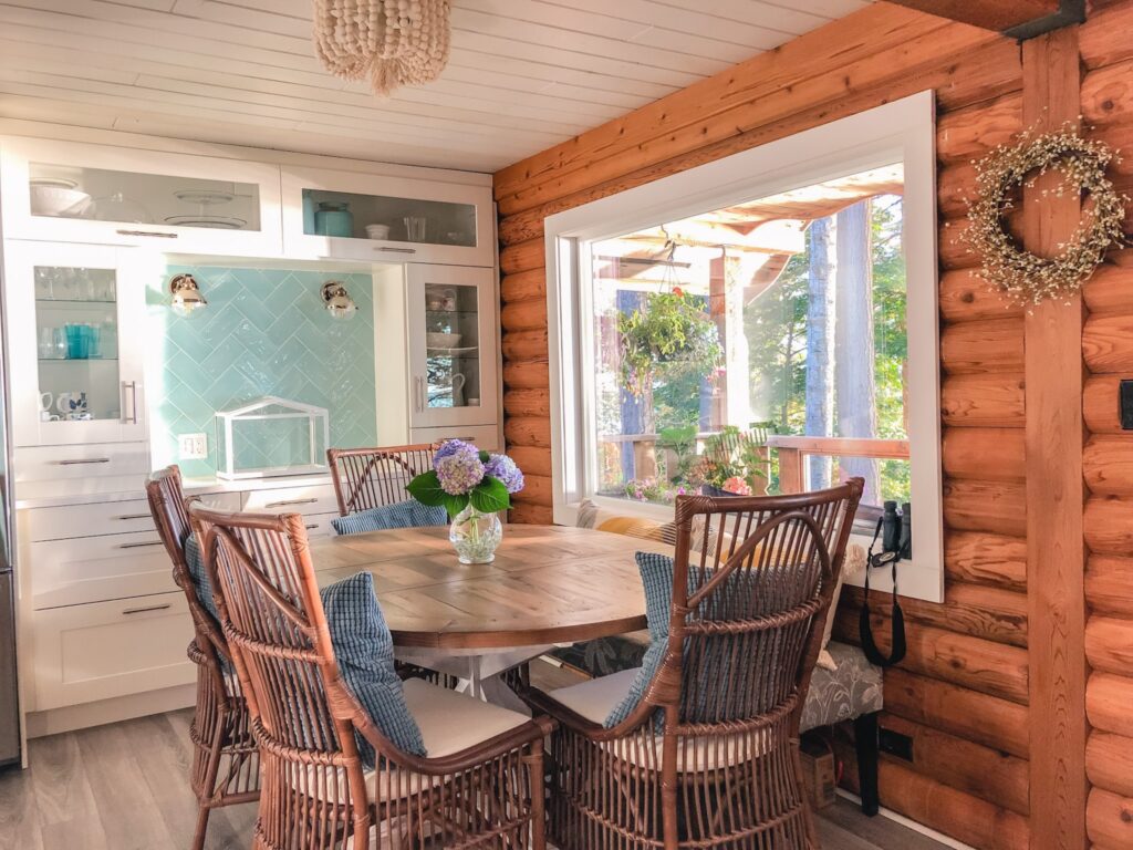
At the Beach Chalet, the dining space is smaller. I adore these coastal dining chairs. And the bench at the back means that the view isn’t impeded. Notice that it is a pedestal table which means that it’s easier to get around with no table legs in the way. And it can extend from round seating for four to an oval which fits up to eight.
I provide placemats and napkins for guests as well. It’s these little extra touches that really make a difference.
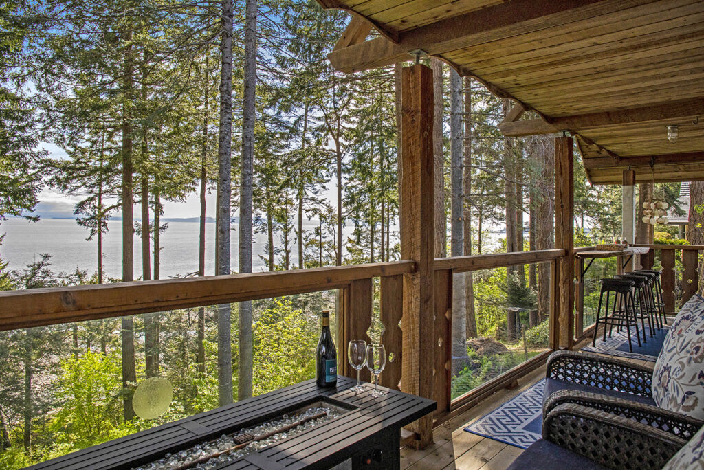
With a narrow deck, there isn’t room for a dining table so this live edge bar top was the solution. It’s made from a log found on the beach and retains its live edge. The patio fire table allows guests to sit out on the ocean front deck, even when it’s a bit cooler or in the evening. Some guests never leave the deck!
A big part of the experience at both locations is dining al fresco, watching either the lake or the ocean as guests dine.
tips for designing for short term vacation rental dining areas
- Have enough seating for all guests
- Provide both indoor and outdoor seating
- Provide placemats and napkins
Designing kitchens
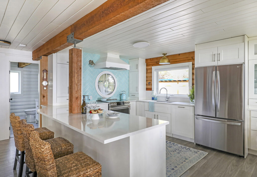
Just like when it comes to selling a home, kitchens can make or break a rental. As more and more people cook for relaxation, many want a fully equipped kitchen in their vacation rental. The kitchen at the lake house was completely gutted with an IKEA kitchen complete with a quartz topped peninsula installed in its place.
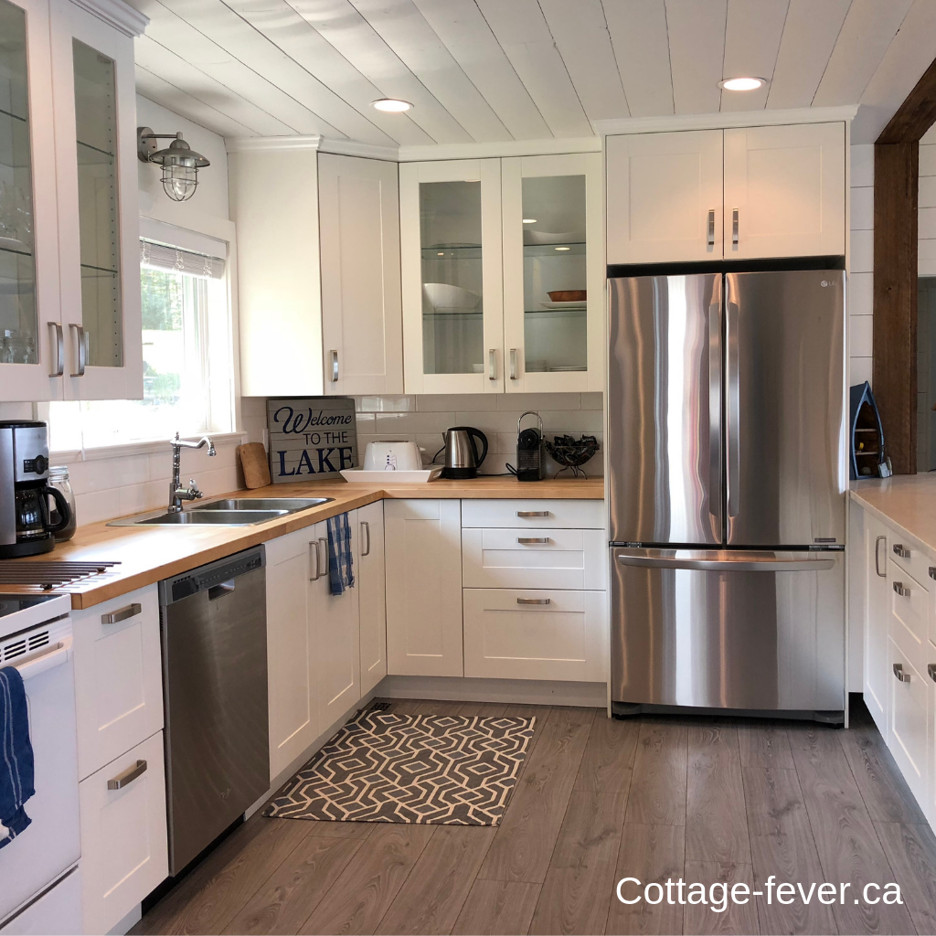
I have a dishwasher as who wants to wash dishes on vacation? There is ample room for two chefs in this kitchen with a very large U shape. Glass cabinets and the stainless steel appliances reflect light back into the kitchen. Under cabinet lighting means that the work surfaces are illuminated as I don’t want anyone cutting themselves if they can’t properly see what they are chopping. An outdoor barn light over the sink and barn board beams add a rustic vibe to this lake side retreat. And often outdoor lights are a fraction of the cost of indoor lights and look amazing!
If the location hadn’t been so remote, I would have put the quartz on the main work surfaces (too difficult for measuring and fabricating) and put the butcher block on the peninsula . Everyone leans their arms on the peninsula countertop while sitting there on bar stools and as stone feels 15% cooler than the air around it, makes it a bit chilly.
Let’s just say that designing around that post was challenging. Quartz countertops are easy to clean and hard for guests to damage. The dishwasher is “panel ready” which means that it just looks like another cabinet, making the kitchen feel larger than it actually is. An induction range really appeals to all the chefs. And good lighting in the form of sconces and a semi-flush mount over the sink, all on dimmers, is essential.
The aqua tile and round window are show stoppers as are the kettle and toaster that match the tile. Adding whimsy and making your listing instagram worthy is key. And the kitchen is fully stocked with every pot, pan, dish and utensil a vacationer could need.
tips for designing vacation rental kitchens
- Ample counter space
- Room for two cooks
- Modern appliances
- Appropriate lighting
- Fully stocked
Designing Bathrooms
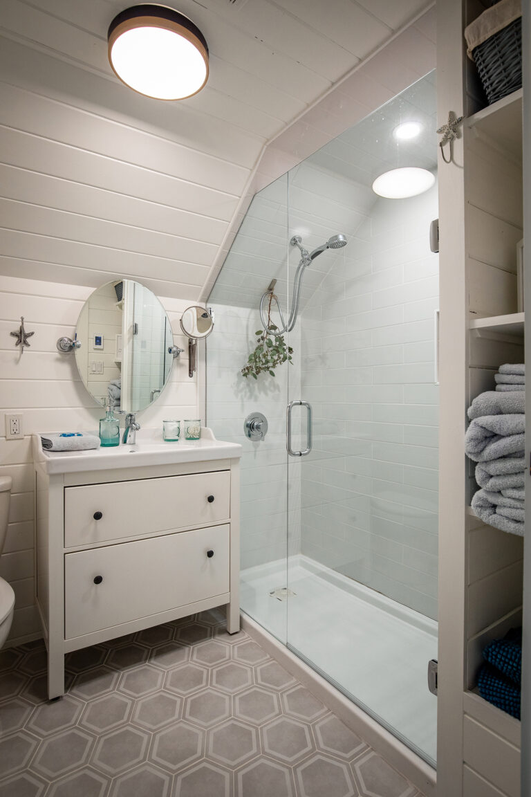
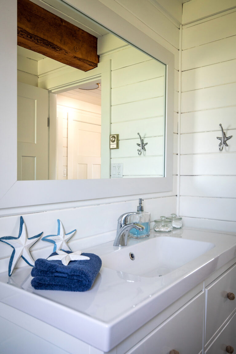
The Beach Chalet has two full sized bathrooms. The outer walls in the main floor bathroom are log which I (gasp) had painted white. I added a large IKEA vanity, new flooring, new toilet, shower curtain and framed the existing mirror and voila, it is a completely new bathroom. I fully gutted the upstairs bathroom, removing a green bathtub and installing a custom shower in its place. Bathrooms MUST be clean and nothing says cleaner than white.
Tips for designing vacation rental bathrooms
- Vanity with counter space for toiletries
- Co-ordinating towels and lots of them
- Decor items such as starfish
- Fun shower curtain - this is the beach after all!
- Large mirror
designing mudrooms
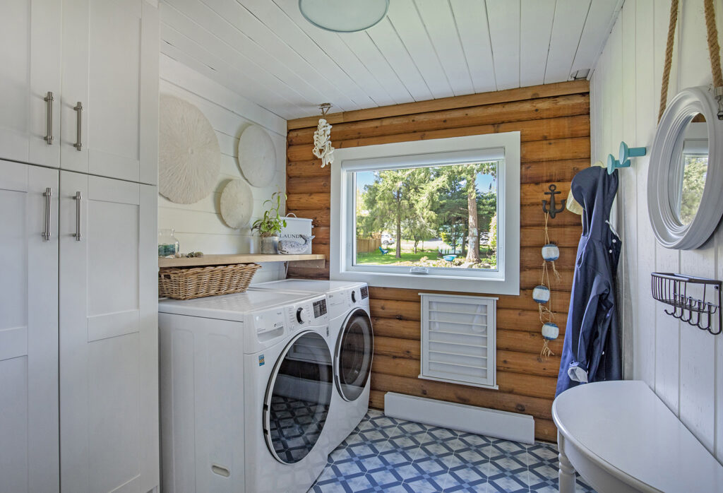
Extraneous jackets, shoes, skis, wetsuits, fishing gear, and more is out of the way when stored in a mudroom. At the lake house, which got quite a bit of snow, I even installed heated floors to help dry up any that gets tracked in.
Hooks are so much easier for hanging up jackets and coats than a closet. Baskets are perfect for storing casual shoes or a boot tray for the rainy season. A bench with a cushion makes for a comfortable spot to put shoes on for older guests.
tips for designing vacation rental mudrooms
- Boot trays for shoes
- Plenty of hooks for hanging bags and jackets
- Basket for gloves and hats
- Hooks for keys
- A rug to catch the dirt before it gets tracked into the house
Added touches that make designing a short term vacation rental so much more special
Seasonal displays, fresh flowers from the garden, napkins that co-ordinate with your decor, all make a huge impression.
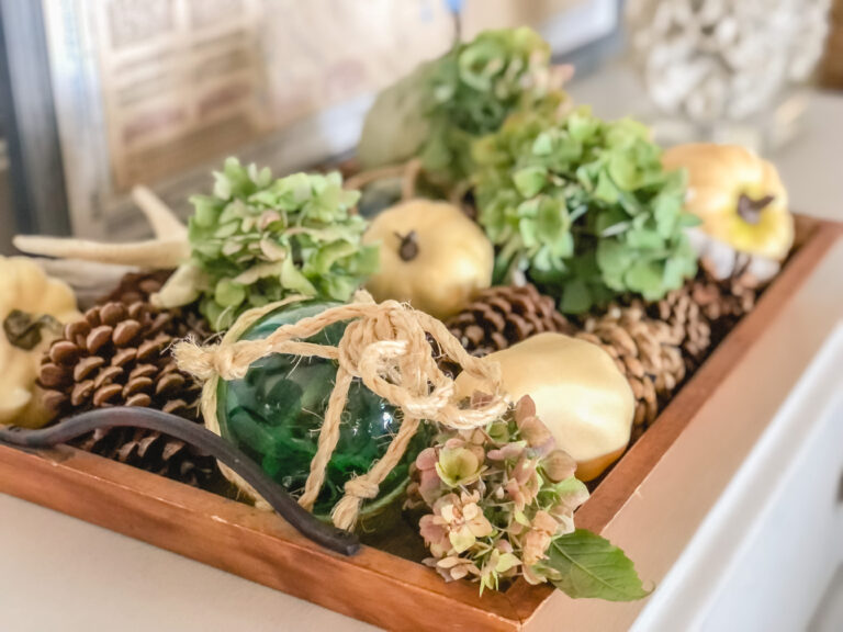
I love changing things around and decorating for every season. Having a vacation rental allows me to indulge my creativity, constantly improving the design and therefore the experience.
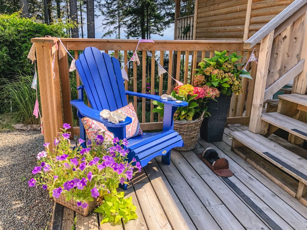
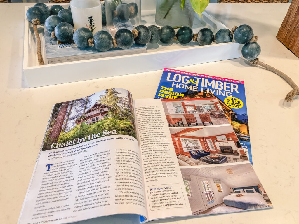
Not only are my reviews amazing, my little Airbnb was featured in an international magazine! If you’d like to check out my listing for yourself, click here.
Thanks for stopping by.
And if this all seems too overwhelming....
Just reach out for a virtual consultation. Contact me by clicking the button below
Click hereshopping guide

