Have you ever picked a paint colour to find that it didn’t turn out to be anything like you expected, once it was on your walls? It can be difficult just knowing where to start when choosing a colour palette for your home. It’s quite a nuanced art to choosing colour and many factors come into play…
Your personality
Or you an introvert or an extrovert? Is your closet full of black, white and grey? Or is it packed with bright pinks, oranges and reds? This is the first clue to your colour personality.
You know instinctively which colours make you feel happy and which ones you can’t stand. Your closet is the perfect place to start searching for your inspiration.
How you want to feel in the room
Do you have a hectic lifestyle and you want a place of peace and serenity? Or perhaps you love the tropics and want to feel permanently on vacation. Colour plays a strong factor impacting the ambiance of a room.
Each colour can invoke an emotion. For instance, red is stimulating so not a good choice for a bedroom but could be for the dining room. Blue is calm and serene for some and for others it feels cold and unfriendly. Yet navy can feel very sophisticated. Yellow is sunny but can make people feel agitated. Green is associated with health and good luck. So it’s very important that you understand the mood you want to convey before you paint.
Is there anything more relaxing than staring at the ocean?
Direction the room faces
The direction a room faces impacts the amount of light it receives. And without light, there is no colour. A north facing room needs warm colours as the northern light brings out the cooler tones so you need to avoid any colour with a green or grey base. However a south facing room can handle cool pale tones such as a soft blue creating a watery seaside look.
With west and east facing rooms, the light changes dramatically throughout the day. Of course an east facing room is bright in the morning and then appears cooler in the afternoon whereas a west facing room gets dramatic warm light in the afternoon.
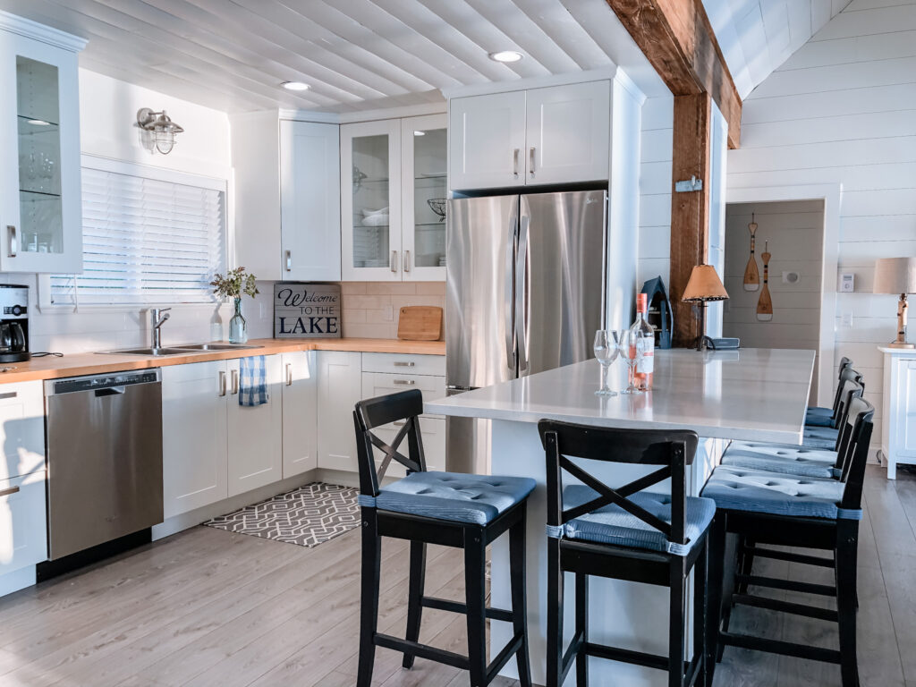
Our cottage faces due west and we also have the light reflecting off the lake. We went with a warm white on the walls and a cool white on the ceiling, a cool grey on the floor, all balanced with blue accents.
Time of day that you use the room
If you have a nook which you only use to eat your breakfast, perhaps you want a sunny colour that’s going to wake you up. In your bedroom, you may want softer, more soothing colours to lull you to sleep. Regardless, you need to decide where you’re going to spend the most amount of time in a room and choose a palette that works for it. A west facing media room that will only be used at night when dark out, doesn’t need to factor in the warm afternoon light.
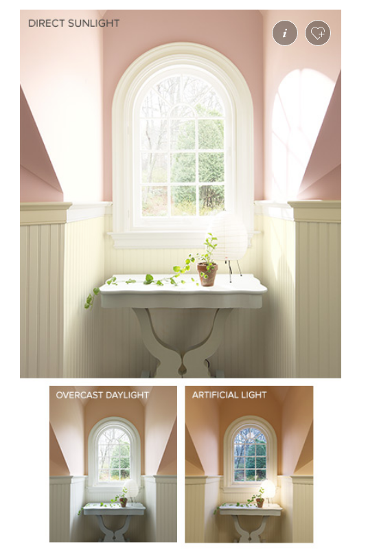
You can see in the photo below, how differently the colour reads in direct sunlight, overcast daylight and in artificial light. The most interesting colours are those that shift during the day and in different light.
Courtesy Benjamin Moore
who is using the room?
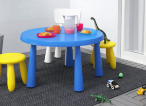
If you’re painting a kid’s room, then primary colours can work. But perhaps introduce bold colours on a piece of furniture rather than a wall. You can also have lots of fun with the room such as painting stripes on the wall or putting up large graphics.
An infrequently used guest room allows you to be a bit more daring with colour, creating a memorable experience for your guests with something more dramatic. Have fun with a vacation home as you don’t have to live with the colours and so can be a bit more bold.
Ikea's children's furniture
What's outside the window?
Is it a solid green lawn outside? Believe it or not, that green will impact how your eye reads the colour inside your room. Is there a building or a wall outside your window? That light will be reflected off the wall into your room and affect how your eye reads your wall colour. Red, orange or yellow can balance a shady light whereas blue, violet or green can make a sun filled room feel more balanced.
Look to nature for inspiration
Not sure if two colours go together – look to all the combinations in nature. A bird’s plumage, a flower’s petals, the various blues and greys of the ocean… If it works in nature, it will work in your home.
And also in nature, the ground is always darkest and the sky the brightest. Always paint darker colours lower on the wall (if using two colours such as below a chair rail). Otherwise it will feel as though the walls are toppling in on you.
The roof of this barn informed the colour choices at our cottage. Click on the photo to see how it turned out.
The size of the room
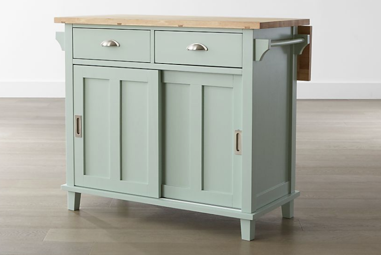
A long narrow room needs a darker colour on the narrow wall to make the whole room seem more balanced. A small powder room can be dramatic with a bold paint colour. A small room could use a dose of brightness. Colour can be used to fool the eye to make a large room feel cozy and a small room feel expansive. It can visually heighten or lower a room. Cool colours recede and can make a space feel larger. A strong central colour can make everything around it feel lighter and brighter. A lighter kitchen around this island (pictured from Crate and Barrel) will appear larger.
how much of a good thing is too much?
While there are no hard and fast rules in design, there are guidelines that have stood the test of time. One such guideline is no more than five colours in a room.
A good rule of thumb is to pick three colours, one of which is dominant, one recessive and the third an accent. You can switch their hierarchy from room to room.
Conversely, you can pick five or six colours and use them in variation. In one room you might choose to use a colour on a pillow and in the next room it’s a wall colour.
Rhythm and repetition
A colour should be repeated at least three times in a room. This allows the eye to travel around and it creates a sense of balance. Accents such as pillows, art, plants, even tissue boxes all come in to play.
In an open plan, ensure that all wall colours complement each other. You can also use colour to create a focal point if your space is lacking one.
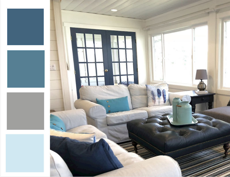
The navy from the door is repeated on the pillow, ottoman and in the rug. The grey from the lampshade is repeated on the sofa, the floor and the rug.
Colour schemes
Analogous - groups of three colours that are next to each other on the colour wheel such as green, blue-green and blue
Monochromatic - a single base colour (hue) that is extended using the tints, tones and shades of the same colour. A tint is adding white, a tone is adding black and a shade is adding grey
Complementary - opposites on the colour wheel such as blue and orange
Split complementary - the two colours adjacent to the complementary colour such as blue with red-orange and yellow-orange
Triad - colours are evenly spaced around the colour wheel
Dominate and accent colours
You can’t use all your colours with equal weight. Pick one dominant colour and use the rest as accents. You can repeat this throughout your home but switch up which colour is dominate and which are the accents. An accent colour should never be the most predominate, it is there to add depth and make you smile.
The fifth wall - the ceiling
Many a painter will recommend “ceiling paint” for the ceiling. Don’t listen to them! Treat your ceiling as the fifth wall as it’s absolutely vital to the overall colour sheme.
Use a white that’s sympathetic to the wall colour so that the eye is much less aware of where the wall ends and the ceiling begins.
If you don’t have any crown moulding, then using the same colour for the ceiling as the walls can be effective such as on a coved ceiling.
If ceilings are very high, a darker tone on the ceiling will lower it and make it feel more intimate.
Putting it into practice
If you want to read how I put this all into practice at our cottage, click here.
Is this all too overwhelming?
Get in touch and we can discuss how I can help you.
There are so many factors that go into choosing a paint colour. Hopefully this post has helped to break it down a bit more so that you can put what you’ve learned to use. As always, thanks for stopping by. Feel free to comment below if you have some other factors that haven’t been listed here.